While working with a quality improvement (QI) team at a local community hospital we were talking at a team meeting and came to a shared conclusion: Our official, pre-made slide deck template was cramped and kind of unusable. It had a multi-color splotch in the bottom corner that was just a little bit too big, and each slide repeated the values of the organization. There was too much visual clutter, and not enough variation in the slide layouts.
So we set out to make a slide deck that was a little bit more our own. This would up as an opportunity to work through a really basic design process with my team. As a team we discussed what we needed and set two goals for the redesign:
Redesign goals
- (Somewhat) align with the organization’s visual identity.
- It says “quality improvement” with the way it looks.
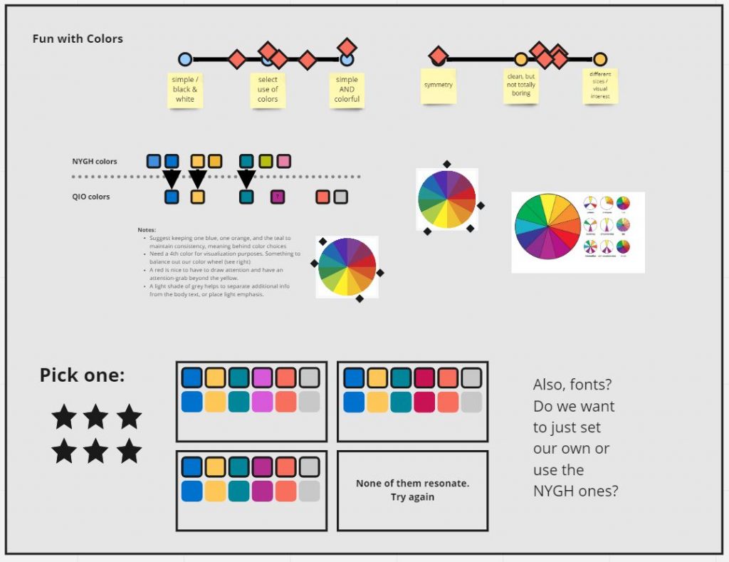
1. Setting some visual guidelines
The organization already has it’s own visual identity, but our team felt that it did not allow enough room and variation for us to make our own distinct information. We built off the organization’s visual identity for the colors used, creating our own offshoot that incorporated primary elements of the original.
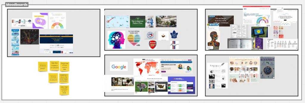
Since we wanted to incorporate a visual element to the slides, I asked the team to create moodboards that would help us talk about what we did or didn’t want.
Visualizing quality improvement
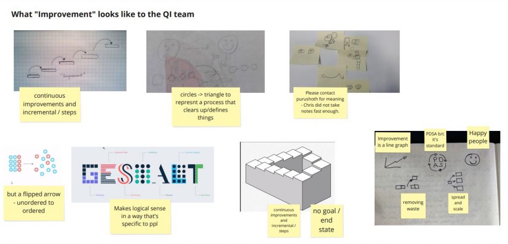
We all agreed that the slides should speak to what quality improvement does, but had a hard time articulating what that was. At the time, I was hosting a bi-weekly workshop series for the team to practice and learn design methods of change. Each workshop started with a 5-10 minute warm-up activity, so I felt this was an opportunity.
Using this warm-up activity, I gave the team 5 minutes to answer the question:
What is improvement?
After some short discussion, we set out to do some quick sketching. Responses could be text, pictures of sketches, or images from the web. Visuals were highly encouraged but not required. At the end of 5 minutes, we presented back to each other and gave our rationale.
See a screenshot of the images and discussion notes below.
Making the slides
Luckily our team had plenty of visuals that they felt spoke to “improvement.” The next steps were to convert these into some draft slides and get team input. I did this separately, then came back to them with some drafts for consideration over email.
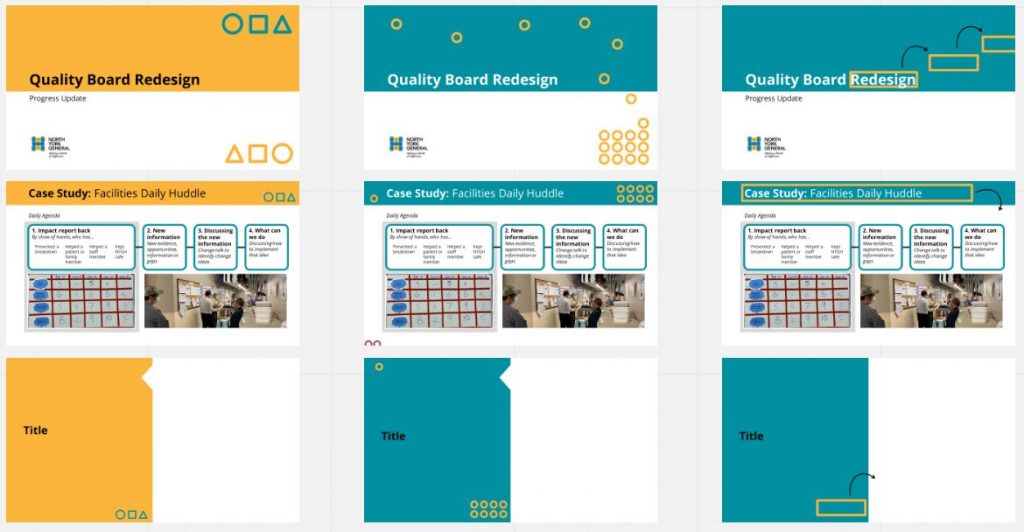
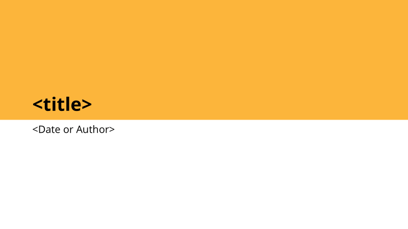
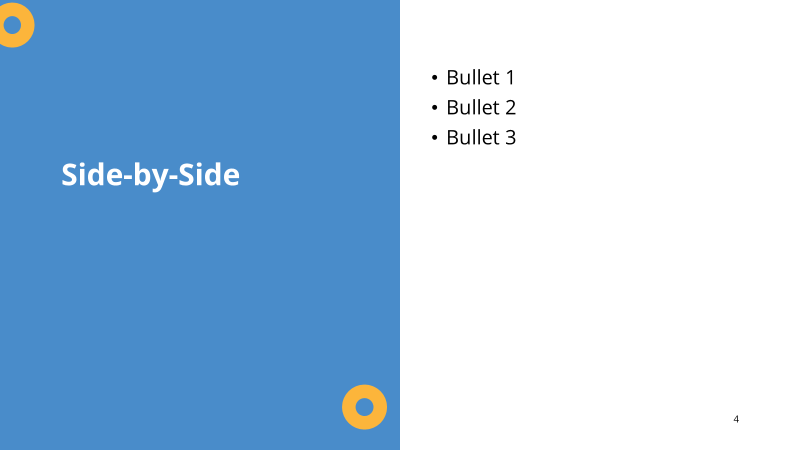
The final slide deck
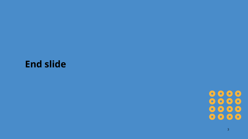
The team voted for their favorite via email and I made some revisions to create our new, team-designed slide deck! The final output was made using the Slide Master in Powerpoint, so that the template could be implemented by anyone who has used Powerpoint before.
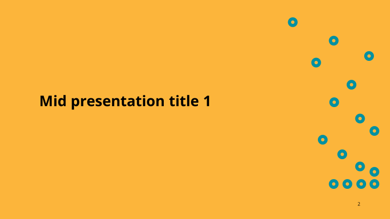
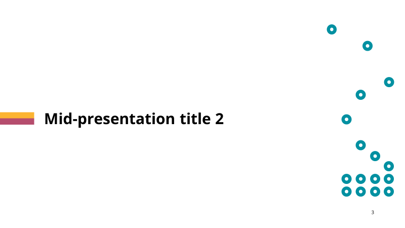
The final visual concepts chosen to represent improvement was ultimately called the “cheerio” slide deck, after the small circles on the screen.